Further Development Times and Fine-Tuning For Argyrotypes
Following further recent experiments with Agryotype, and from reading John Blakemore, I’ve been revisiting my developing times for FP4+ with Pyrocat HD 2:2:100. This has firstly allowed me to iron out processing errors I’ve been making lately. My original tests from last year had N at 10’30 and N-1 at 8’05 (a time reduction of 23%). It’s also reminded me to not be lazy with my metering, and to annotate the zonal placements when I make an exposure.
For some reason lately (reading from the wrong page of my notes / not properly updating my phone’s timer app) I’ve been processing at N = 12’, which represents virtually an N+1 overdevelopment, about 15% above N (in the ballpark that John Blakemore has for stepped expansions and contractions).
This is fine if I’m scanning my film but not great if I then want to make argyrotypes with highlight contrast, and is I think one (!) reason why I only managed one successful argyrotype from my last printing session: the white Clematis produced very little detail in the highlights at all (the other errors were because of overeagerness – I exposed the paper before it had sufficiently dried so too much subsequently washed off – I note that Mike Ware recommends drying for 1-2 hours at 20ºC; I had good results in warmer spring conditions with drying for 30mins at 28ºC room temperature, but no shorter than that). This sadly means I’ll have to wait another year to reshoot the white Clematis flower to attempt another argyrotype, while I can still enjoy the scanned version – I think I’d prefer to use a fresh negative than attempt to dodge a contact-print in progress.

Reading Blakemore also means that I’ve been reassessing my developing times. I’m happy with N, N-1, and N-2, but N+1 has now been reassessed given the white Clematis failure. So I’m now going to put N+1 and N+2 at 116% and 132% above N. These times are for developing at 21ºC. I add 9% for every 1ºC above this if I’m developing in warmer conditions.
What I’m also planning to test next is how Argyrotype reacts to expansions and contractions in developing, and how to read these with the zone system. I’m currently working with expansions and contractions as per silver gelatin defaults (using zone VII as the cut off point), and not as per Pt/Pd (I’m not convinced from my tests so far that Argyrotype can approach the tonal subtlety of Pt/Pd in the highlights, but have yet to work with a negative that really tests this).
(So my assumption is that this is more realistic than Platinum/Palladium according to some notes I have, for which expansions and contractions work as follows:
N-1 = zones 2-10, 8 stops
N = zones 2-9, 7 stops
N+1 = zones 2-8, 5.6 stops,
N+1.5 = zones 2-7.5, 4.2 stops )
The one-third digital darkroom
During this Covid19 period I’ve been pondering still life macros on 8 x 10 black and white film. The challenge I’ve been facing has been to strive to get beyond the Edward Weston / Ansel Adams cliché. A pleasurable morning spent reading John Blakemore’s Black-and-white Photography Workshop has set off some light bulbs in my head for new creative explorations. Beyond his technical mastery of black-white developing and printing what is also so striking and suggestive about his book is his conceptual open-mindedness and free-spirited sense of exploration. What I found particularly fascinating this morning was reading the still lives section about the making of his thistle photographs, where he explores the different effects of exposure time in developing technique using the zone system; and also, even more impactfully, his ‘fictions’ series.
This seems to be a particularly useful point of departure from the ‘1000% percent authenticity’ approach of Weston / Adams. What Blakemore did with this series was to make double-exposures of the still life scene, the first exposure to include both ground and subject and the second exposure to just include the ground. This produced a wonderfully mysterious tonal effect where highlights in the subject were unchanged but midtones and especially shadows slowly melded with the ground exposure. This seems great to me because the whole point is to challenge the viewer to think carefully about what they’re perceiving, which is what all photography should be about; but still life is so often, especially in large format circles, totally dominated by the quest for authentic photographic reproduction; and this tends to cliché very readily.
There is also a very pleasing sense of craft in everything Blakemore does and this is all for the good in the enrichment of the sense of enjoyment that to me is the whole point of using a large format camera in the first place. To me this will also be an interesting experiment: it will be intriguing to see the extent to which a double-exposure technique can be made to work to make alternative process argyrotype prints.
Beyond these conceptual nuances it’s also been useful to read John’s discussion of the photographic toning of black-and-white prints. This is a book that is completely devoted to silver gelatin and darkroom work, but that doesn’t mean that photographers who use digital cameras, or photographers who use a blended workflow, don’t have much to learn from John if they’re interested to make the most of black and white imagery.
This book can teach you all you need to know about toning I think! – not simply as a technical exercise but fundamentally as to do with the aesthetics of the final print or image.
I’ve been reminded of the benefits of split-toning for warmth and contrast and tonal depth / richness. So I thought I’d try to replicate this quite straightforwardly for the digital part of my workflow in Photoshop. The natural place to go to do this is the gradient map tool. Paring back the aesthetics of toning, selenium produces depth and warm to the shadows whereas gold toning producers a cooling in the highlights; combining these two can add texture, depth, and richness.
To achieve this effect in photoshop is quite straightforward. You just need two gradient map layers at very low opacity e.g. 5% or less, and use the colour picker to select a dark red tone for the shadows in one layer and a light blue tone to the highlights for another layer. You can also add a darkening and contrast curve to add a bit more richness to the image as well.
Here’s one I made earlier!

I’ve also added a new little section on my 8×10 film-holder tapes, where I can annotate very succinctly but clearly the precise zonal metering decisions I took. This is very much overkill for work intended for scanning, but will be useful for the techniques discussed above, and will also help me to further hone my technique for the traditional alternative prints I make. Here’s a mockup of a new-style film-holder tape.

New Portfolio Website!
I’ve been meaning to get this sorted for a while – a new portfolio website for my work, concentrating on my large-format film photography work since 2016.
Go to: davidfearnphotography.co.uk
I’ll keep my WordPress account running as a source of information, resources for large format, and musings, but will no longer be updating the galleries here.
Hopefully I’ll be able to focus my attention increasingly on new creative directions with large format.
The beast is back (partly)!
So yesterday I finally got out for a walk, to recce Whichford Wood with the Hasselblad, and I shot a roll of Portra 160.
I got back home and, after 10 months, Thames Valley police have recovered & returned my RZ67 Pro II – stolen from the boot of my car while I was out with the 8×10 at Wayland’s Smithy on the Ridgeway at the end of June last year. I’d tipped them off after a week re. a suspect ebay site… I’m happy but frustrated – everything seems to be working, and a few of the accessories that I’d taken a while to collect for the camera – a spare Pro II back, covers for the backs, strap, cable release, rare but excellent Really Right Stuff QR plate – had come back with the camera. Sadly a few key items were not recovered – the lens hoods and front caps, and in particular the 110mm lens. I did though get the 50mm wide lens back, so that’s a start.
This allows me to directly compare the systems – and I have to say that the RZ comes out favourably. Here are a couple of pics of them side by side, with the wide-angle lenses on both cameras (the 40mm CF Distagon on the 500C/M).

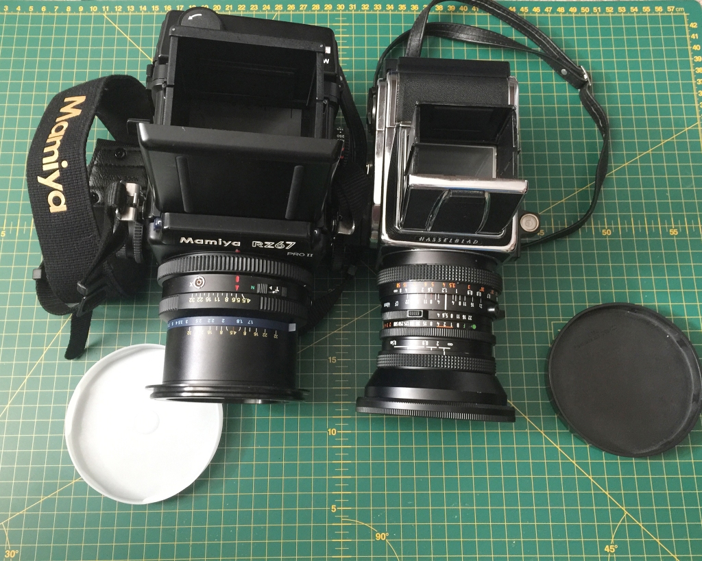
I never got to play with a Hasselblad before buying the Mamiya, and all the positives of both systems may also feel like negatives depending on one’s outlook. But having now used both for quite a while independently and now bringing the two together for the first time, I do think the RZ wins.
It is unquestionably the case that the Hasselblad is more hand-holdable, and marginally more user-friendly; it’s also entirely mechanical, which still astonishes me.
However, the things on the RZ which I notice today are things that really make me love the camera more. These are: focusing, lenses, and the back.
Focusing on the RZ is I find much easier than on the Hasselblad. This is for two reasons: first, the bellows focusing, and second, the size and brightness of the viewfinder. These are noticeably different. The Hasselblad viewfinder feels a lot smaller than it is by comparison, and helical focusing on this kind of system feels really odd now that I have the RZ to compare it with. The focusing on my 80 Planar is a bit stiff, and even with the 40mm I find this a bit unintuitive esp. when handholding – the fine-focusing side knob for the bellows seems so much more obvious. The only thing the RZ doesn’t have which the Hasselblad does is the EV interlock. The RZ stop-down lever is a much better design than the Hasselblad too.
Though I only currently therefore have the wide-angle lenses to compare, it seems to me that the 40mm Distagon is a bit too big for the V-system. It’s bigger and heavier than my RZ 50mm, and unbalances the camera. It’s probably a slightly better lens with better micro contrast (I have the standard 50 not the floating lens version) but this is offset by the size of the thing. It’s pretty cumbersome, and comes with a massive front lens cap which is a loose fit, meaning that the whole lens has to be stored in its own pouch in my bag, adding further to the bulk.
Of course this feeling that the lens overbalances the body is partly because the RZ body is such a beast compared with the Hasselblad. But this is for a very good reason – the rotating back system. Loading film into each is very simple, but the RZ backs are so cool and the system is brilliantly designed.
I’ve noted down some weight stats to compare the two two-lens systems, and the Hasselblad comes out favourably, obviously.
Basic Hasselblad:
500C/M Body with WLF, 2 backs, 80 CF Planar and 40 CF Distagon = just over 3kg (NB 40mm lens weights double the body)
Basic Mamiya
RZ67 Pro II Body with WLF, 2 backs, 110 and 50mm lenses = 3.8kg
Why I originally felt that the RZ was such a beast was the bag I bought for it (also not recovered). This was a lovely Billingham 307, but it was probably too big, and at 2kg by itself, this meant that a total weight of more than 6kg, which was no fun.
What I have to do now is fine a nice 110mm lens, and a replacement bag that weighs the same or less than the bag I use for the Hasselblad – a Billingham Hadley Pro. The Billingham bags are lovely designs and are waterproof – essential for shooting in Scotland, should that ever materialize any time soon – but they are expensive and heavy. Something more modern might fit the RZ style a bit more neatly in any case.
In essence, then, I’ll be keeping the RZ I think. What happens to the Hasselblad is not yet clear.
The sheet that has me yearning to shoot colour slides again on large format.
Blue Streak

Porth Meudwy, Aberdaron, North Wales
2.45pm 16th February 2018
Linhof Technikardan S45
Nikkor-W 210mm f/5.6
Fujichrome Velvia 50
1/2″ f/22
245mm bellows extension
5º front tilt
Home-developed with Jobo CPE-3 and Tetenal E6 (FD 7mins 10secs)
Digitized with 4-frame stitch on lightbox with D800E/85PC-E
From a trip where I wild-camped on location in the carpark. The advantage of doing this was that I could stay on location across the whole day until the sun was low, instead of having to pack up for the 4hr drive home again. I was able to watch the light change around the cove, and discover a range of different scenes and subjects across the different tide levels: this was the last subject I found I think before heading back.
This is a sheet I successfully rescued last week, one of the very few which I managed to incorrectly develop at home (I think I mixed the colour dev in the E6 incorrectly, never again!) and came out with a slide of Velvia 50 that looked like an inverted sheet of colour neg – horrid cyan cast. Happily, I managed to redit this very successfully in photoshop – and, along the way, even learning some new post-processing tips from Alex Burke’s e-book for slide (something I didn’t think I needed but learned a lot from).
And it’s making me want to shoot some more colour film on large format, maybe even 8×10!
I’d probably – at least for wider landscape views if not for intimate or macro scenes – not want to shoot Velvia, instead looking for a more contemporary look, possibly with warmed up and de-saturated Provia, or Portra 160. But if I shoot colour neg, I definitely need to up my confidence in inverting negs for a consistent result.
I’ve also recently been enjoying thinking with other contemporary large-format film photographers, such as Alex Soth and Bryan Schutmaat, and have one or two new projects lined up, both for colour and b&w. The problem is that the bigger you go with film, the more absorbing the process, so I might give 8×10 colour a go as well as B&W. I have Stearman SP810 trays as well as jobo tanks for 5×4 and smaller, so can process any size of film at home up to 8×10, so that’s not a particular issue – though I will have to run some tests with colour dev temperatures across the process with the stearman first, esp. without a temperature controlled water bath. I’m thinking thermos flasks for controlling warm water temperature, and one simple water bath for reusing the chemistry for a second batch. Fingers crossed!
Lockdown Macro with 8×10
Taking up the opportunity of lockdown to do some photography, in a house full of film cameras (and, happily, quite a lot of B&W chemistry), has taken me back to appreciate the technical mastery of the 8×10 greats like Ansel Adams and Edward Weston. I’ve so far managed 2 compositions over the last few weeks, with two exposures for each.
Both have been successful in their different ways, I feel. The second of the two of these is one I especially enjoy, made yesterday.
I used two different lenses for these, and took two different approaches.
With the apple, the first subject, I went full-Weston and chose a tiny aperture and a long exposure time. For so small a subject (by 8×10 standards) I used my (usually) super-wide Nikkor-SW 150. The difficulty with this is the maximum open aperture of f/8, which makes macro work very difficult since the ground glass is so dark. For the slightly larger flower, and the setup for it that I chose, my Nikkor-W 300 was the obvious choice. Here I made wide-open exposures, and introduced some rear tilt forwards to slightly alter the focus plane some more. For this second image I worked with and without a Lee 23A light red filter, and selected the exposure with the filter because of the more even tone of the flower petals (otherwise too dark in the corners: the Clematis flower is very magenta pink).
Lockdown Apple (after Edward Weston)

29th March 2020 3:15pm
Chamonix 810V
Nikkor-SW 150 f/8
ilford FP4+ 8×10
430mm bellows extension
33 minutes @ f/64
Stearman SP810 tray, Pyrocat HD 2:2:100, 16’, 21ºC
Acetic acid stop, TF-4 Fix, Hypoclear, wash, Ilfotol rinse
“It has been suggested that I am a cannibal to eat my models after a masterpiece. But I rather like the idea that they become a part of me, enrich my blood as well as my vision.” Edward Weston
Lockdown Clematis

22nd April 2020 11:45am
Chamonix 810V
Nikkor-W 300 f/5.6
Ilford FP4+ 8×10
500mm bellows extension
Small amount of rear tilt forwards
Lee 23A light red filter
11 seconds @ f/5.6
Stearman SP810 tray, Pyrocat HD 2:2:100, 12’, 21ºC
Acetic acid stop, TF-4 Fix, Hypoclear, wash, Ilfotol rinse
Alt-Pro: Argyrotypes and Cyanotypes
I finally took the plunge this week and made my first alternative process prints from 8×10 negatives. It has taken me a year of reading and researching, and purchasing of equipment, to get me to this stage. That I’ve had about a 50% success rate with my prints thus far is I think pretty good; the best are stunning!
Here are a few tips on equipment and processes that I’ve picked up along the way. NB I’m UK-based, have no darkroom or inkjet printer, and am doing this at home. So certain chemicals and therefore processes are off-limits; as is making digital negatives – which is of course cheating anyway!!!
Mindset and Reading: These are the two most important things!
Mindset: if you just want to have a go because it’s interesting and different, then I would say don’t. It’s a waste of time, effort, and expense unless you actually want to do really think about why you’re doing it. For me, this is all part and parcel of buying the 8×10 equipment at all – a substantial outlay compared with the cost of even the beautiful Lotus 12×14 printing frame I’ve bought recently. Yes, if you’re really into black and white photography and want to really push the look and tone of your prints then I would consider it, but I would also say that you should think about why you want to do this. In particular, I would stress the importance of working around a project that you come up with or discover.
I admit that I got into it for both reasons, but had to quest a bit for a project that would work. It’s very easy (relatively) to fall into the trap of cliché photography with 8×10 alt pro: pictures of old buildings, for example, the feel of which is of course enhanced by a 19th-century process but has little by way of originality. This is where my “Acontius Project” has stepped in: 8×10 (and some 120) images of graffiti on trees has made me re-think my attitude towards photographing trees and woodland quite markedly. I’m gently weaning myself off 5×4 Velvia imagery because I’m really searching for a little more creativity with my image-making: the hand-crafted look, not simply the vision and technical perfection required to shoot a great 5×4 landscape image on Velvia. The “Acontius Project” allows me to work locally and think about what I’m trying to convey by a ‘pastoral’ feel to the images of trees that I make. Being able to control the exposure effect completely both in film (for which I would strongly recommend FP4+ developed in Pyrocat HD) and printing makes this brilliantly creative too. I can scan the sheets of film as well and play around with them on computer for posting on social media online, but the achievement of a tactile print in the hand is wonderful.
I would say that it is essential if you’re at all interested in alternative process prints to buy the magnum opus on the subject, Christopher James’s The Book of Alternative Photographic Processes. This is written in a very laid back almost hippy-ish style by an American with a ton of experience, and is quite brilliant once you understand that the style is part of the point. Creative mastery is of course important because you can try to control the response of light and chemistry for your own stylistic effect (cf. Sally Mann), but in order to do this you have to be laid back and thick-skinned. This is NOTHING like printing from a computer, let me tell you!
The second book I have is Christina Anderson’s book on Cyanotype. It’s more detailed – and more fussy – than the James book but has more detail on the process and how to control it, so is useful.
Finally, online resources are also very important. Reading up on others’ practices and results is very useful indeed; raiding e.g. flickr for people’s technical notes is a good place to start. NB I’m not doing platinum/palladium yet. Given the cost of chemistry involved, I think I’d want to go on a dedicated workshop for this before trying it myself.
The two processes I’ve started with are cyanotype and argyrotype. Other than I think salt printing and possibly albumen printing (and also platinum/palladium), these are the two processes that seem easy to start with, as you can buy premixed sensitizer so do not have to worry about particularly dangerous chemistry and powders; in any case, some processes involve chemistry that cannot be purchased for home use in the UK. Cyanotype and argyrotype nicely complementary too because you can get a pair of prints, one cool and one warm, or process negs separately and see which process they suit best. After developing nearly 20 prints, I’m heavily leaning towards argyrotype, except for one or two exceptions where I really want the effect of high-key highlights. I imagine, though, that this might very well be project-dependent.
Other than chemistry and a set of developing trays, pipettes, and pots and brushes for each process, I’m currently reliant upon sun for exposure though may be about to buy a UV lamp for more control.
Here’s my setup for printing at home, including purchase info where relevant. Argyrotype can be a little more involved but seems worth the effort. I’m using Bergger Cot 320 paper for both, which works great (using the smooth side of the paper). I store finished prints in A3 sleeves from hobbycraft (see also below for Argyrotype).
Cyanotype:
Set of 3 12×16 Paterson trays
1 pack of plastic pipettes (Hobbycraft)
1 Daler-Rowney hake brush (Hobbycraft)
1 2-litre plastic jug with gradations (pound shop)
1 set of plastic measuring spoons (pound shop)
1 glass chopping board (Sainsburys)
1 ceramic dipping bowl for pouring chemistry onto paper (Ikea shot glasses would also be good; my dipping bowls came from a Scottish pottery, handily in three different colours)
Paper towels
1 11-inch windscreen wiper blade (Halfords) for removing water after wash
1 pack of premixed old cyanotype chemistry (WetPlateSupplies) – 2ml of each for 8×10 print.
1 pot of citric acid (WetPlateSupplies)
litmus paper (Amazon) for setting pH of citric acid ‘developer’.
For toning (if desired: do this a day later)
Yorkshire Tea
Household Vinegar
Soda Crystals
Process: 5 minutes wash in 1500ml of water with ¾ tsp citric acid crystals to ~ pH3, then a further 10 mins with a change of water in tap water. Dry and then tone if wanted.
Argyotype:
As above but also/instead
1 lemon for acidifying water.
5-litre bottles of distilled water (Halfords)
Fotospeed Argyotype chemistry
1 pot of hypo crystals (WetPlateSupplies)
1 bottle of Tween 20 (WetPlateSupplies: helps sensitiser work into paper better).
I dilute this (10 drops per 50 drops of distilled water) in the measuring cup in the Fotospeed kit and add one drop for 3ml of sensitiser per 8×10-sized print.
1 small portable (collapsible) dog kennel (Pets At Home) (!!)
with large sponge and a setup for suspending sensitized paper in a steam bath inside (a pound shop will be able to provide a range of useful items). The dog kennel thing is a bit Heath Robinson but works well: it also now doubles as a useful space for drying 8×10 negatives. The idea is that for argyrotypes you pre-humidify the paper for tonal effects. You pour boiling water on a sponge in a try inside the dog kennel, suspend the paper inside, and cover with a black binliner until ready. 5-15 minutes (or 30 minutes) seem times to go with depending on what you read where. This is something to do with the size of the molecules in the paper being affected by humidity, leading to changes in colour of the sensitizer as it reacts to UV light differently.
Expose: from 9 minutes (Fotospeed instructions); sensitised paper inside a Crystal Clear (or similar) display envelope, to protect negative/frame from humidity and keep it in the paper.
Process: 5 minutes wash in 1500ml of distilled water with squeeze of lemon juice, then a further 10 mins with a change of water in tap water.
Hypo: 4 and a bit teaspoons of hypo crystals in 1500ml tap water, constant agitation for 3 minutes.
Wash: 1 hour, 2 changes of water.
Exposure times so far: in full sun nothing short of 10 minutes has been particularly successful for either process in sunlight. Fotospeed recommends 9 minutes for its argyrotype sensitizer; Anderson recommends 23 minutes UV lamp for cyanotype developed in citric acid bath on Bergger Cot 320 paper. NB UV lamps are about four times slower than full direct sunlight?
Argyotype humidity effects: drying paper for a couple of hours, then prehumidifying for about 10 minutes produces a dark grey/brown effect with warm highlights which is attractive. Exposing paper only a few minutes after senisitizing produces a very brown result indeed. Somewhere in the middle seems good, possibly: further experimentation seems appropriate!
Argyrotype negatives also need to be more dense than cyanotypes, so I have started to shoot doubles, but this will be very much dependent on the contrast in the scene shot.
Here are some samples below, with details (just iphone snaps at present):
Acontius Project “Bob”:

Argyrotype, Pre-humidified 10mins, 27mins exposure in early morning sunlight
Acontius Project “Fraxinus in silvis pulcherrima”:

Untoned cyanotype, 18mins in early morning sunlight
Great Coxwell Barn Porch doorway:

Argyrotype, 10mins 10secs in mid-morning sunlight, freshly coated but allowed to dry, no prehumidication, full sun with some cloud
Experience, Effort, Power, Depth: Anyone who can should.
Thoughts so far on 8×10
A few thoughts I’ve been noting down in my mind on my experiences with 8×10 so far, now that I’ve had the excellent Chamonix 810V for a month or so.
Even as a now pretty experienced large-format photographer with 5×4, it was with a bit of trepidation that I set out on the 8×10 journey. There were three reasons for this – and none really to do with Gear Acquisition Syndrome (if that kicks in a black Leica M6 TTL with 35mm Summicron would fit the bill, lol!).
Reason one: curiosity – as per Winogrand, good photography tends to get you thinking about the relation between the image-making and the world, rather than simply being straightforwardly or unproblematically representational. I’ve worked with 5×4 long enough to know that the ground glass is a transformational tool, and I simply couldn’t miss the opportunity to experience this with a glass four times the size. And what would the chosen scenes, looked at and enjoyed on the glass, turn out like when processed? Had to find out.
What I’ve immediately discovered is that nothing will quite prepare you for the three-dimensionality and complexity of detail of an 8×10 sheet. What this complexity and depth does is to add mystique and life to even the most mundane-seeming of subjects. 4×5 can do similar work, but 8×10 is the full monty.
Reason two: black and white. I’ve grown up a pretty strong collection of colour images on 5×4, mostly on the superb Velvia 50 film stock. But I’ve never really given black and white a proper go. I’ve probably exposed less than a box of Delta 100 on 5×4, and have wasted a load of chemistry that has expired without use. In the space of a month, I’ve now exposed 6 sheets of FP4+ 8×10, and am using Pyrocat HD staining developer, because of its properties with UV that assist with alternative process printing, and because of its long shelf-life – I can have it sitting around for quite a while and it should be fine to use. A variety of toning options for post-processing and prints – including on the digital scans via photoshop – avoid the worry of boringly similar flat and uninspired images.
Reason three: vision. I hoped – and though this is still a work in progress – so far this is going pretty well – that 8×10 would enhance my skills and creativity as a photographer. I’m still to try out a number of things – e.g. I’ve not yet even used my 450mm lens, or tried any closeup work with bellows extension – but so far the effort required in setting up and perfecting a shot does really make you think about what you’re trying to achieve. I hope to get even more creative as I go on and have only really been doing tests with the equipment so far, but the results have been pretty great. I’m hoping to take this to the next level over the summer when I hope to try out traditional alternative process contact-printing – perhaps Cyanotype and Argyrotype first, possibly moving to Pt/Pd if I can dare/afford to do so. I have a lovely plan to make float mounted contact prints on 12×16 paper in large frames – and all with no inkjet printer in sight. The challenge here will be the eschewal of all digital post-processing controls – a comfort blanket! Will my exposure, filtration, and developing technique be up to snuff?
One obvious worry with 8×10 is basic: what a faff? Well, not really – at least coming from 5×4. My kit for 8×10 weights about the same as my Linhof 5×4 outfit, and the Chamonix camera comes in a wonderful padded field bag. I worried that a wooden camera would be less stable and precise than my Linhof Technikardan. While in some ways this is true, but not so obviously, there are positive trade-offs. With the 8×10 it’s basically impossible to even make an exposure without the controls being locked down. Standards would move, and so forth. On the Technikardan, for a camera otherwise so brilliantly designed, it’s surprisingly easy to overlook one of the locking clamps/screws and have a slightly – or seriously – unsharp result. While it’s an amazing camera, its severity at times can make a fool of you – actually, I think this is part of the compromise Linhof made in creating a hybrid monorail camera. The simplicity of the Chamonix is its great strength, in fact. It’s a tried and tested design where every control works in an intuitive way. It has a good balance between simplicity and good movements/extensions, and the size/scale of the camera is such that it’s very easy at all times to understand what is happening. The easiest comparison here is with rear tilt, I think. It’s actually quite hard to figure out how to get rear tilt to work on the TK because the little control toggles get hidden under the dark cloth and are basically in the wrong place. Not so with the big wheels on the Chamonix. Unscrew, trust the groundglass, and re-tighten: simple. Similarly with front movements (even with very heavy glass, as Nikkor SW150 and W300 attest) – this will take more practice, but I’m pretty certain that with some judicious control of the knobs on each side, it will be possible to properly control tilt and rise and fall with one hand (with the other on the loupe under the dark cloth). The bellows is great, and the velcro on the top front is very handy for controlling the bellows with tilt on wide-angle lenses – though for major rise and fall a bag bellows will be worthwhile – hopefully the one I have now ordered will arrive in the coming days.
Working with 8×10 film is a great and surprise joy. The Chamonix film holders are truly excellent, and the film is surprisingly easy to load – even as I have a Harrison Jumbo tent because I’m using BTZS tubes without a darkroom and need the extra room for these. The possibly envisaged nightmare of hairs and dust all over the film hasn’t been a problem at all. Developing with BTZS tubes is very flexible when you have a couple of sheets to develop, but with the extra steps involved with Pyrocat HD, I’ve been developing these individually rather than in pairs, which doubles the time. There are other systems for developing 8×10 but they’re either similar (e.g. using a modified Patterson Orbital print processor) or very bulky and very expensive (the Jobo professional 3000-series tanks), or require a darkroom (no chance!). I’ve now devised a kind of hybrid process whereby I spin the BTZS tubes in my Jobo water bath – there’s just enough room to do this – this saves a bit of space, and also obviously allows the water temperature to stay pretty static – important if you’ve got a number of sheets to process sequentially over an hour or two. If I could find a way of speeding this up a bit then I’d find the developing more enjoyable.
Power and depth – those negatives are a thing of beauty. During the process of being interviewed for Genius of Photography TV series that I have on DVD and have been rewatching lately, Joel Meyerowitz – famed NYC Leica street photographer – gets out his Deardorff 8×10, puts up a single 35mm slide against the ground glass, taps the ground glass, and says: ‘Spatial power: if you want spatial power… This.’ Not wrong. The sharpness, contrast, and detail in 8×10 does really strange things to the perception of landscape and subjects that nothing else I’ve ever seen can.
If you’ve tried 4×5 and enjoyed it, then 8×10 will be more of the same (in all senses).
Two more images I developed last night and scanned this morning, from Otmoor (and the surrounding area), in Oxfordshire.
Dawn among the reeds

The Secret Stillness

More 8×10 Notes
Developed and scanned the other two remaining sheets from my first 8×10 outing, and have the following further observations.
Image 1: Brightwell Barrow, Wittenham Clumps

A test shot, primarily: will want to return when crops are fully grown in any case.
Lens: Nikkor-SW 150 f/8
1/15” f/22
11º down angle on head from level, 1º extra front tilt, rear tilt back to vertical – equates to large amount of front fall and front tilt.
Bit of vignetting to crop out from corners in sky – not very surprising given implied movements.
1) Scanned this one at 2400ppi. Clear that, for my 15inch MacBook Pro with 16GB Ram, a Grayscale file of at least 1.5GB is too large, esp. if I then convert to RGB for toning.
Two faults that are obvious on screen, if not in detail on ground glass at x4:
2)
f/22 is not sufficient depth of field to provide proper sharpness to tree in background. I was concentrating more on wind and shutter speed, but f/22 looked fine.
3)
sky almost uniformly grey. Lots of editing in Photoshop including via platinum toning to get sky contrasty. Should have used my yellow/orange filter, still with my 5×4 kit, or a hard grad. This former would have heavily affected the shutter speed, of course. I have to remember that even with B&W, where I want the dark tones in the sky can matter as much as it does with E6 colour slide.
Image 2: Wittenham Clumps (shot from about 15 feet from previous, looking the other direction)

Lens: Nikkor-W 300 f/5.6 – first exposure with this lens, bought off ebay from Japan – basically mint.
½” f/45
10mm front fall, ±2º front tilt, a bit of rear tilt backwards to ‘loom’ foreground even more.
Same problem with filtration though matters less with this one. Seem to have overexposed it by at least 1 stop (esp. compared with previous image). No problems with development; scanned at 1600ppi and toned and use of curves/platinum gradient in photoshop to assist darkening and contrast.
First 8×10 exposure
Great Coxwell Barn, Oxfordshire
13th April 2019, 1:20pm

Chamonix 810V
Nikkor-SW 150mm f/8
Ilford FP4+ 8×10
29″ f/32
camera bed tilted up and rear and front tilt forward applied for front rise effect.
Lower part of main left door frame metered at -3, N-2 development indicated.
Home-developed with Pyrocat HD 2:2:100/BTZS tubes, 8mins 30secs.
Scanned with Epson V850/Silverfast AiStudio8 (16bit, 1200ppi, film delicately taped to diy silicone mat), cropped in from right and toned gently in Photoshop.
No problems at all, with camera/lens/setup, exposure, or developer. Marvellous.
Recent Comments
Studio Arago on Lockdown Macro with 8… The Evolving Natural… on Lithika, Dinorwic George Sheils on Experience, Effort, Power, Dep… Simon on New and Old… dwf on Large Format Diaries
Images from my Flickr Account
")


